Herb
Lubalin
A biographical look at the typographic designer's lucrative career.
WHO WAS HERB?
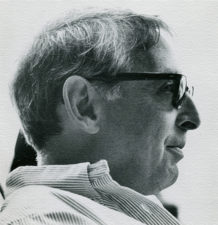
Herbert (herb) Lubalin was born in March of 1918, in New York City. With supportive parents and a keen interest in how typography can affect the world, Lubalin entered Cooper Union at the age of 17. Soon after graduating, he became particularly “fascinated by the look and sound of words (as he) expanded their message with typographic impact.”. After graduating in 1939, he worked as a freelance designer and typographer. He eventually landed a job at Sudler & Hennessey inc. In 1945. where he worked for 19 years working his way up to graphic design director.
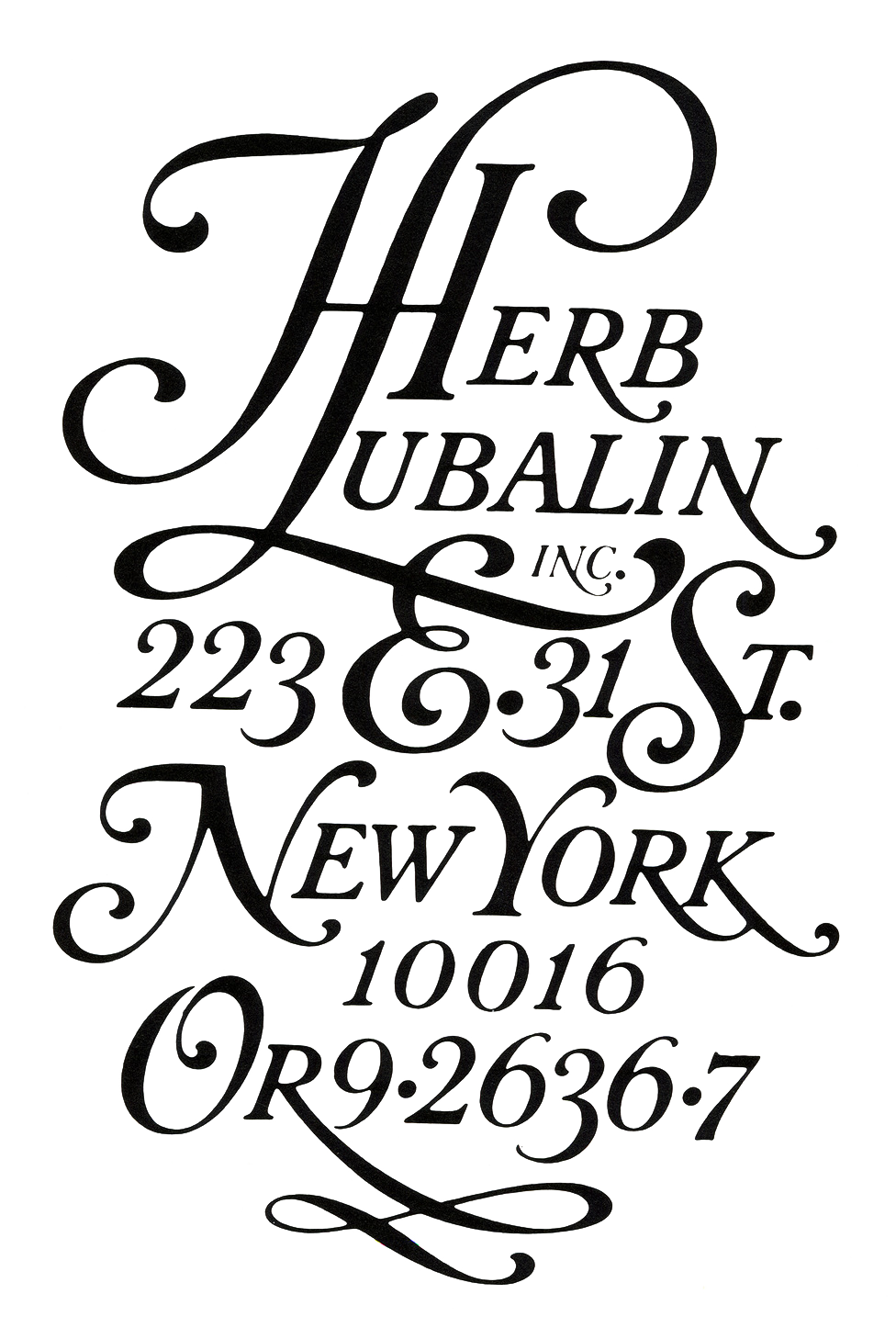
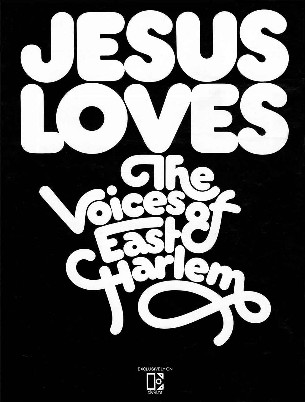
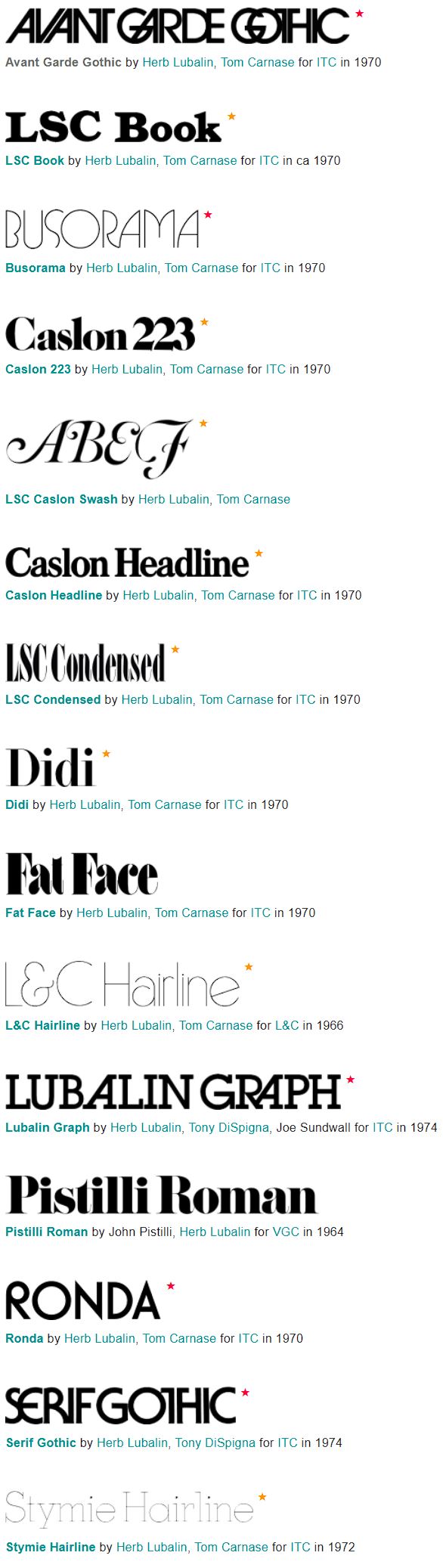
Lubalin left Sudler to start his own firm, Herb Lubalin, Inc., in 1964. Here is where his most popular and best works were created. He worked on various projects over the years, most notably his magazines. Lubalin and publisher Ralph Ginzburg created three magazine runs: Eros (1962-1963), Fact (1964-1967), and Avant Garde (1968-1971). During his time here, he also designed several common typefaces that are still used today, such as Avant Garde Gothic (1970, with Tom Carnase), Herb Lubalin was known for pushing the boundaries of the typographic design world, with bold statements and unique style in each of his designs.
"
TYPOGRAPHY
CAN BE AS EXCITING
AS ILLUSTRATION AND
PHOTOGRAPHY.
- Herb Lubalin
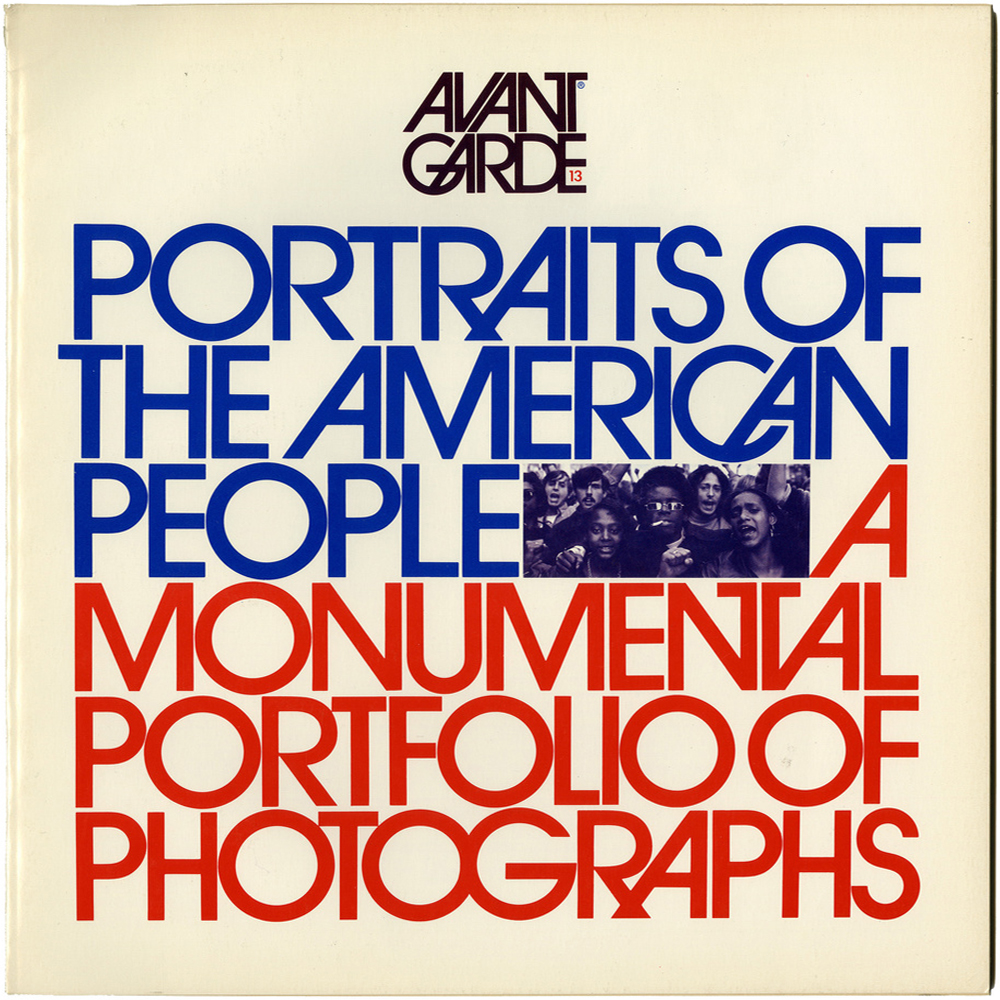
AVA
NT
GA
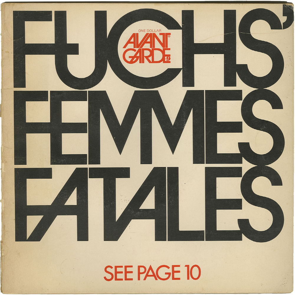
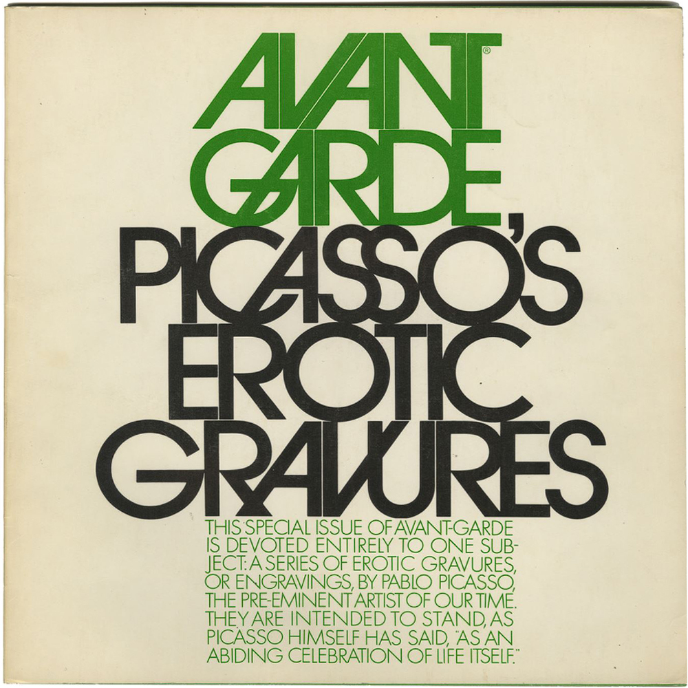
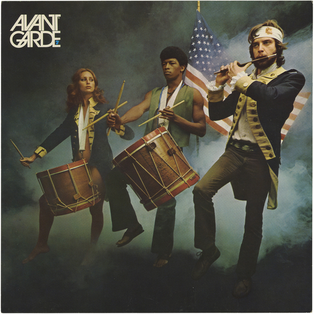
Herb Lubalin is best known for his work on Avant Garde, one of the most adventurous projects he worked on. The magazine gave Lubalin a platform to experiment and have fun with different kinds of type. He experimented with not only unique layouts, but with the size of the magazine paper itself. Avant Garde’s magazine margins were a rather unique 11.25 by 10.75 inches bound in a cardboard cover. This bizarre sizing in tandem with his unique designs and layouts gave the magazine an eye-catching and intriguing effect.
RDE
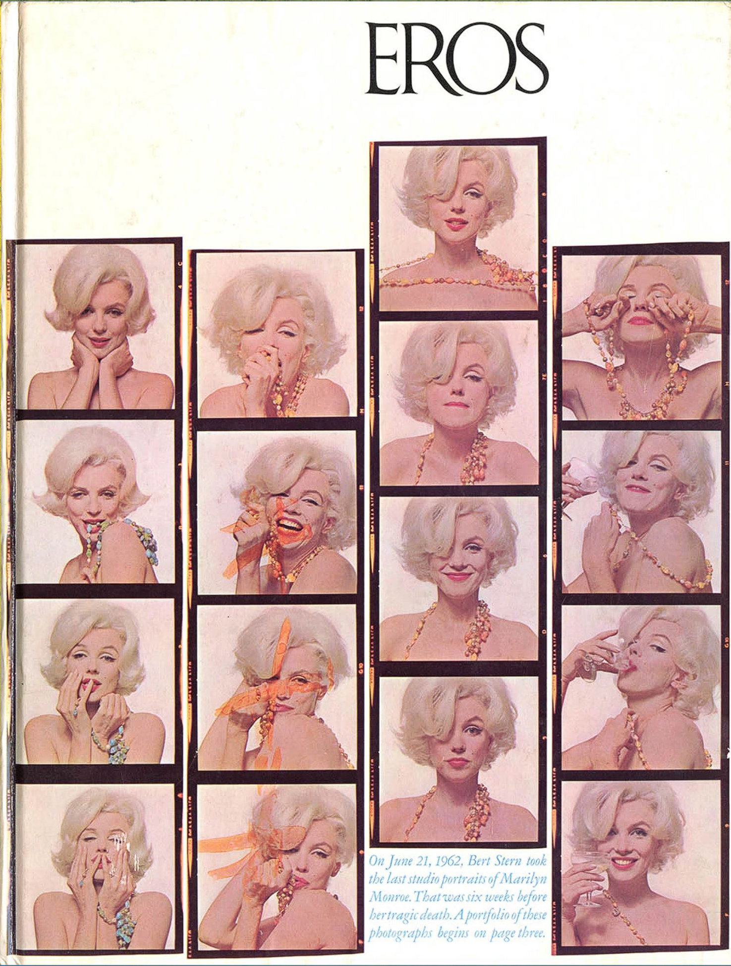
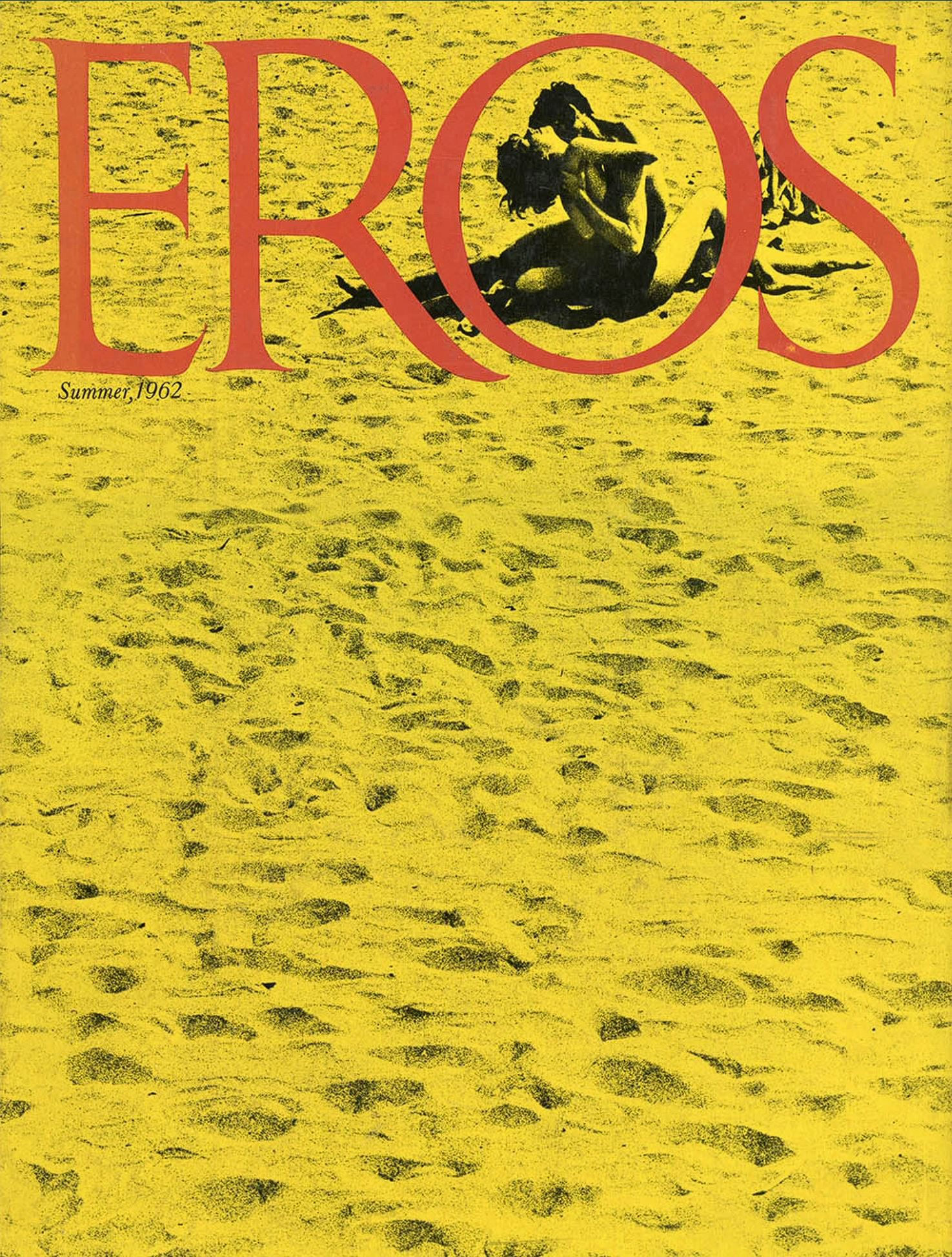
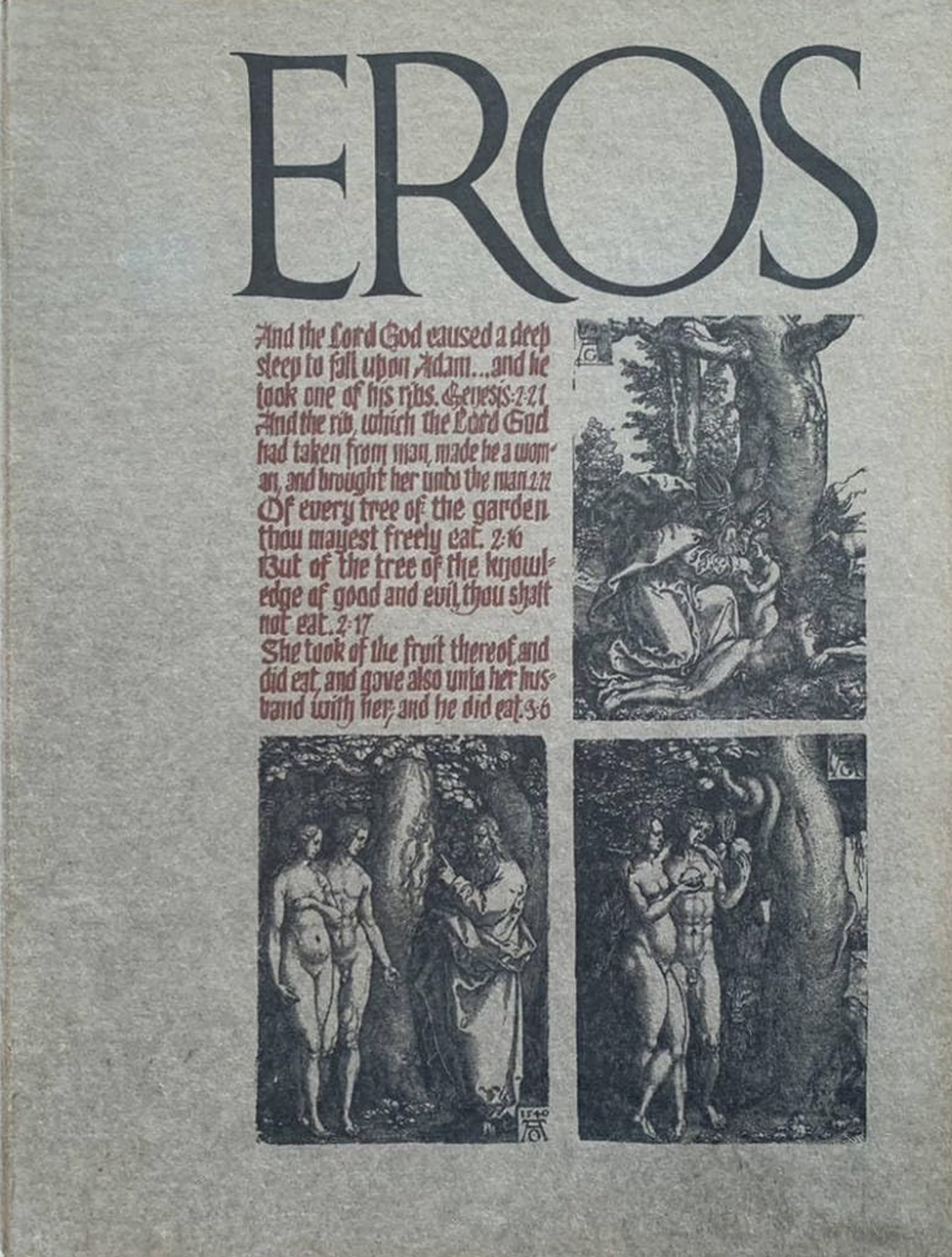
EROS
This was not the first time Lubalin Inc. had pushed the boundaries of print. Eros, one of the earlier magazines that he worked on which first met paper in spring 1962, was even more adventurous. Eros was an exploratory magazine that featured adult themes, displaying unique expressions of love. Lubalin was the art director for Eros’ time, however due to it’s explicit nature it met heavy censorship early on in production through to it’s inevitable cease in publication roughly a year later in 1963.
"
Sometimes
you
sacrifice
legebility
to
increase
IMPACT.
Lubalin's contributions
to the industry
Lubalin’s contributions to the typography industry don’t end with magazines. Of his most popular works, Herb developed several typefaces in his time
ITC Avant Garde Gothic (1970)
His firm’s most iconic font, it being the very same one used in his magazine of the same name.
Lubalin Graph (1974)
A geometrical slab serif with a medium weight, this font emulates a typewriter.
ITC Serif Gothic (1974)
A semi-humanist font that is one of his more whimsical faces. it’s extreme contrasts in both weight and serif style make it very unique.
Tied as these are to Lubalin’s work and publications they helped define, most of these fonts are famously difficult to use effectively. Several designers take inspiration from Lubalin’s eccentric portfolio, his thick / thin weight contrasts, and whimsical serifs being the star of the show.
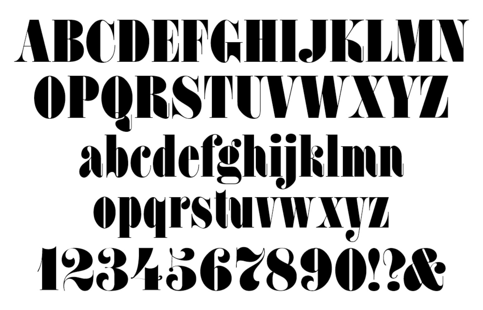
FAT FACE
A closer look
Of the multitudes of typefaces Lubalin has developed over his lucrative career, One of the most interesting ones has to be Fat Face. He developed this font with Tom Camase for ITC in 1974. It’s most striking characteristic is it’s line weight contrasts. The bowls, eyes, and catches of each letter are extremely thin compared to the stems and arms. The font’s humanist forms also provide a unique feel, but sacrifice legibility for aesthetic appeal.
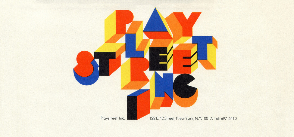
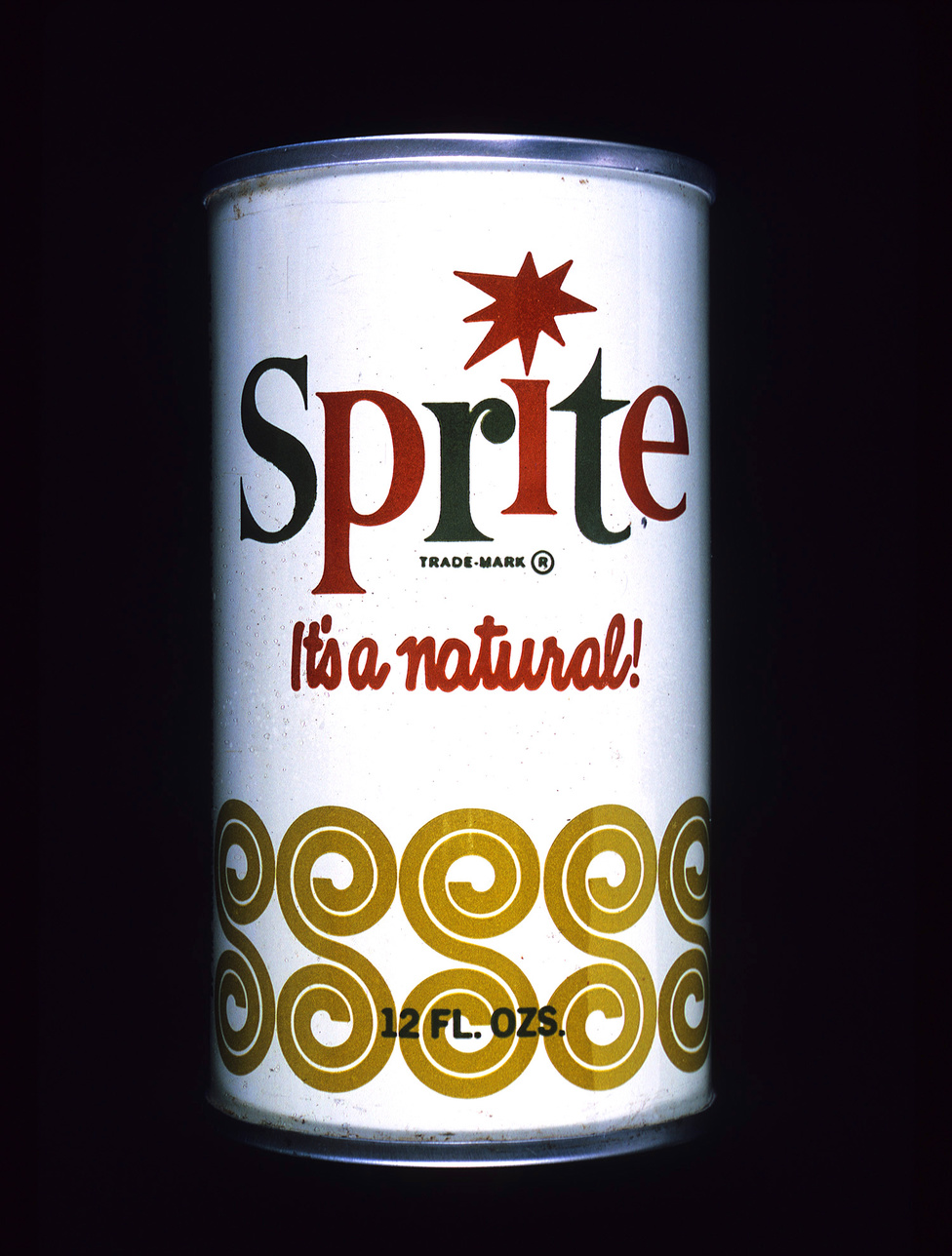
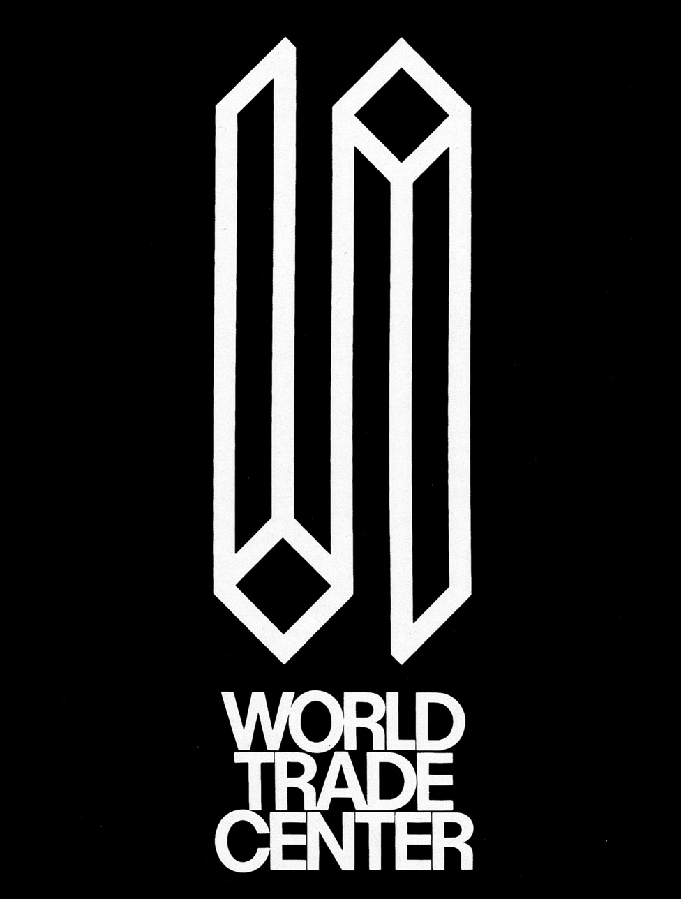
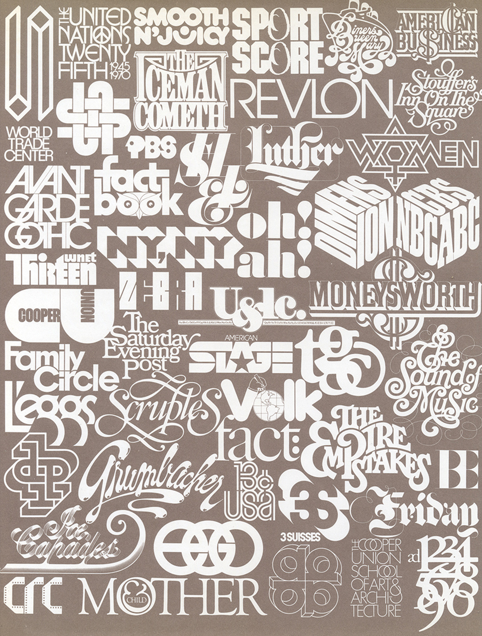
Some other projects Lubalin worked on